Hot Pink HTML Color: The Ultimate Shade Guide For Web Design
Hot pink HTML color is a vibrant and eye-catching shade that plays a significant role in digital design, branding, and user experience. Represented in HTML color codes, this bold hue can transform a web page, drawing immediate attention to key elements like calls to action, promotions, or interactive buttons.
Understanding the Hot Pink HTML Color Code
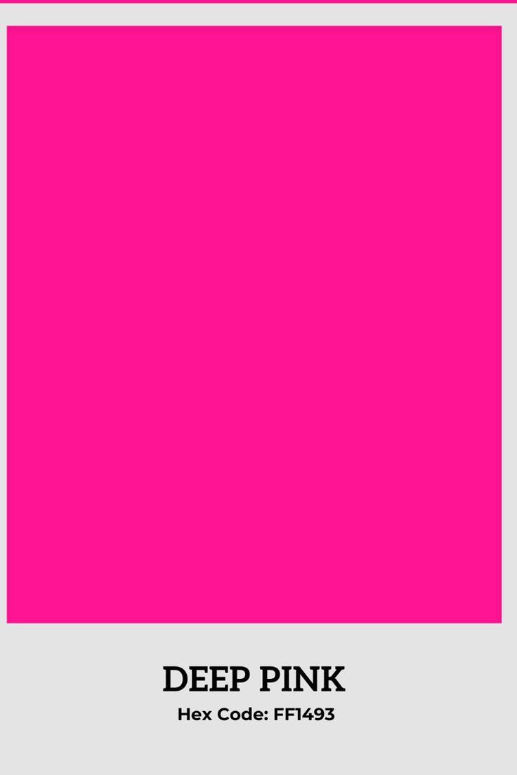
To implement this specific shade accurately across different platforms and devices, designers rely on standardized color codes. The most common representation for a bright, vivid hot pink in HTML is through the Hexadecimal triplet system. The primary hex code for this specific hot pink is #FF69B4. This six-character code tells a web browser exactly how much Red, Green, and Blue light to combine. In this instance, the code delivers maximum red (FF), a moderate level of green (69), and a moderate level of blue (B4), resulting in the characteristic intense pink that defines the color.
RGB and HSL Values
Beyond the hexadecimal system, hot pink can be defined using RGB (Red, Green, Blue) and HSL (Hue, Saturation, Lightness) models, which offer different advantages for manipulation. The RGB value for this vibrant shade is rgb(255, 105, 180). This format is particularly useful for developers working directly with CSS properties or JavaScript calculations. For designers who prefer adjusting color based on visual criteria rather than numerical values, the HSL model provides a more intuitive approach. The HSL representation for hot pink is hsl(330, 100%, 70%), indicating its position on the color wheel, its full saturation, and its lightness level.


Strategic Use in Branding and UI Design
Hot pink is a high-impact color that communicates energy, passion, and playfulness. In user interface design, it is rarely used for large background areas due to its visual intensity; instead, it is deployed strategically as an accent color. Digital marketers often utilize this shade for "Buy Now" buttons, newsletter subscription prompts, or promotional banners because it creates a stark contrast against neutral backgrounds like white, gray, or navy. This contrast drives user focus and encourages interaction, making it a valuable tool for Conversion Rate Optimization (CRO).
Target Audience Considerations
While effective, the use of hot pink HTML color requires careful consideration of the target demographic. The shade is historically associated with femininity and youthfulness, making it a frequent choice in markets related to cosmetics, fashion, and lifestyle brands aiming at younger women. However, modern design trends have reclaimed bright pinks for gender-neutral and bold aesthetics. A tech company might use it to convey creativity and disruptiveness, while a luxury brand might pair it with metallics to convey opulence. The key is ensuring the surrounding design elements support the message the brand wishes to communicate.


Accessibility and Contrast Challenges
One of the primary challenges designers face when using hot pink HTML color is ensuring text readability and digital accessibility. Due to its lightness and vibrancy, placing light pink text on a white background is a common mistake that results in illegible content. Conversely, placing dark gray text on a hot pink background might meet contrast standards for general users but fail for those with visual impairments. To comply with Web Content Accessibility Guidelines (WCAG), it is essential to check the contrast ratio. Tools like the WebAIM Contrast Checker are indispensable for verifying that combinations involving #FF69B4 meet the necessary standards for Level AA or AAA compliance.
Complementary Color Schemes
To create a balanced and sophisticated visual hierarchy, hot pink HTML color should be paired with complementary or analogous colors from the color wheel. A classic and effective combination is the "Pink and Navy" scheme, where the bright hot pink is balanced by a deep, calming navy blue. This creates a dynamic yet stable feel. Alternatively, designers might utilize the triadic scheme by combining hot pink (#FF69B4) with turquoise (#40E0D0) and lime green (#7CFC00) for a vibrant, high-energy aesthetic. Neutral shades like white, charcoal gray, or off-white are always safe choices to prevent the design from feeling overwhelming.
Practical Implementation Examples
Implementing hot pink in a stylesheet is straightforward. A developer can define a class for a primary button as follows:


.hot-pink-button { |
background-color: #FF69B4; |
color: #ffffff; |
border: none; |
padding: 10px 20px; |
} |
By mastering the application of hot pink HTML color, designers and developers can inject personality and vibrancy into digital projects, ensuring the final product captures attention and communicates effectively.



Related Articles

Shades of Pink HTML: The Ultimate Color Palette Guide
Shades of pink HTML present a unique opportunity for designers to inject personality and warmth into a digital interface. While often associated with...

The Ultimate Guide to Color Codes for Every Shade of Pink
Navigating the world of pink reveals a spectrum far broader than the casual observer might assume. From the soft blush of a dawn sky to the bold vibrancy of a...

Hot Pink Color RGB: The Ultimate Shade Guide
When designers, developers, and artists specify the exact digital shade of hot pink, they are often looking for the precise hot pink color RGB value. In the...
Hot Pink Code Color: The Ultimate Hex & Design Guide
Hot pink code color represents a vibrant intersection of technology and design, a specific hexadecimal value that translates to an eye-catching visual...
The Ultimate Guide to Pink HTML Codes: Color Your Website Instantly
In the intricate world of web development, color is more than just an aesthetic choice; it is a powerful psychological tool that dictates user experience and...
The Ultimate Guide to Pink HTML Color Codes – Shades, HEX & RGB Codes
Navigating the digital landscape requires an eye for detail, especially when it comes to color. For designers and developers working in HTML, finding the...